
UX Beyond the Interface: Where Product Differentiation Lives Now
If a polished interface is becoming a commodity, differentiation has to come from somewhere else. Here is where it actually lives.

Jul 14, 2026
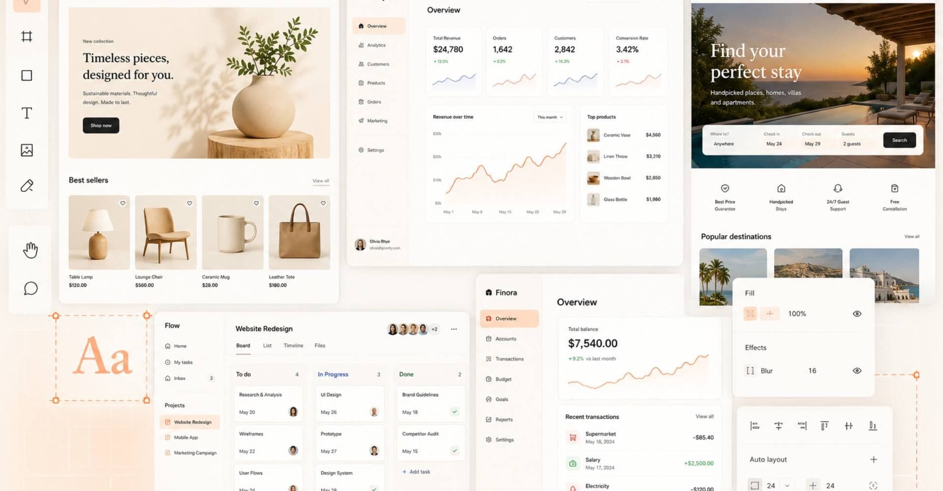
For most of the last decade, a good interface was a competitive advantage. A company that invested in clean navigation, thoughtful onboarding, and a polished visual layer stood out from the ones that hadn't gotten there yet. That gap is closing because polished interface design has become easier to reproduce. Mature UI patterns, component libraries, templates, and product frameworks have made clean digital experiences more common across the market. AI tools now push that further, turning what used to take a design team a full sprint into a layout generated before someone finishes their coffee.
But if polished interfaces are becoming a commodity, where does product differentiation actually come from now?
Deciding what to build, and who it's for, still takes a person, not a tool. What changed is that people used to assume a digital product that looked professional was also built on sound decisions. That assumption doesn't hold anymore. Now the differentiation shows up directly in the outcomes a product (an app, platform, or software) delivers, and how much people trust it enough to keep using it.
Business outcomes are where UX creates differentiation
Design has always shaped revenue. What's different now is who's asking to see the connection: boards, PE sponsors, and CEOs treating product decisions as investment decisions, not just usability calls.
Baymard Institute puts average cart abandonment across e-commerce sites above 70%, and estimates that fixing checkout friction alone could recover roughly $260 billion in revenue across the U.S. and EU. Most of that money disappears for mundane reasons: a form that asks for one confirmation too many, or a shipping cost that shows up on the last screen instead of the first, not because of a bad color choice.

CCI Puesto de Bolsa, one of the top brokerage firms in the Dominican Republic, offers a sharper example. Investors depended on executives for basic portfolio updates, so every new investor meant more calls for someone on staff to take. Growth was tied to headcount, not to demand. Making Sense rebuilt the platform around self-service: real-time portfolio access, digital contract signing, and a flow investors could complete without calling anyone. That kind of change is as much a product decision as a design one, but it's the kind of decision UX research is supposed to produce: understanding that what investors actually needed wasn't a nicer dashboard, it was independence from a phone call.
The results:
- A 3x increase in client engagement
- An 80-90% drop in time executives spent on routine inquiries
- Onboarding conversion up from 22% to 40%
For a PE-backed business, that kind of change shows up twice: once in the engagement numbers, and again at exit, when a buyer looks at whether growth still depends on headcount.
When Making Sense partnered with Opya, the autism therapy provider ran its entire operation on paper and phone calls: session notes, treatment plans, billing, all of it manual. Figuring out where that broke down (parents waiting days for updates, care teams missing what happened in the last session, billing that depended on someone remembering to follow up) shaped what the new platform needed to do, and made it scale nationally.
That's the correlation boards and PE sponsors are asking product teams to draw now: not what got redesigned, but what changed on the P&L because of it.
UI is no longer the differentiator
Visual polish stopped being scarce for two reasons:
- Design systems made a consistent, professional-looking interface cheap to produce.
- AI-assisted tools took it further: a founder with no design background can now generate a passable layout before lunch.
Nielsen Norman Group's 2026 State of UX report calls this directly: UI is becoming standardized the way manufacturing standardized components, and it will keep mattering less as a source of advantage. That leaves an obvious question: where did the differentiation go? It moved into judgment, what to build, for whom, and under what constraints.
This is why Making Sense engagements start with Discovery instead of design. It takes two to four weeks of understanding how a business actually operates, where decisions slow down, and which constraints are real versus assumed. That work produces more differentiation than anything decided later in the process.

That phase is deliberately short: long enough to expose the real constraints, not long enough to turn into an exercise of its own. It usually surfaces the same kind of gap: a workflow gets described one way on a slide, but it runs a different way once you sit with the people doing it every day. A screen built on top of that unresolved gap does not fix the underlying problem. It just delays when the user notices it, usually after the product is already live and the cost of fixing it has multiplied.
The same judgment now extends past human interfaces entirely. Making Sense's work on designing for AI systems found that AI agents increasingly read websites and applications directly, without navigating a UI the way a person does. What used to live implicitly in layout and visual hierarchy now has to be made explicit in structure and rules. A polished screen tells a human what to do, but it tells an AI system nothing unless the logic behind it was defined clearly, in the same conversations that decide what the product actually needs to do.
Trust breaks first when AI gets added without judgment
Generative AI adoption crossed 53% of the population within three years, according to Stanford HAI's 2026 AI Index, growing faster than the personal computer or the internet did in similar periods. As AI becomes more common, users are also becoming more demanding. They expect AI features to be useful, reliable, and trustworthy, and they can quickly recognize when a product added AI without a clear reason or a real user benefit.
Meeting that expectation is a design problem, not a marketing one. MIT Technology Review's coverage of privacy-led UX frames this well: real transparency about what a system knows, and how it uses information, works as an ongoing part of the relationship with a user rather than a single consent screen at signup. When that transparency is missing, the cost shows up as a user who quietly stops trusting the feature and routes around it instead, a drop-off that's hard to detect, harder to fix, and hardest of all to explain to a board asking why adoption of a flagship feature stalled.
Remote Legal shows what getting it right looks like in practice. The digital deposition platform Making Sense built had to make every step of a legally sensitive process, spanning multiple state jurisdictions, legible to lawyers, court reporters, and witnesses who had never done anything like it before. There was no interface trick that could substitute for making the record, the consent, and the chain of custody explicit at each step. The platform didn't lean on flashy AI to solve it. What mattered was deciding, in detail, what each participant needed to see and when.
Understanding the user is the one thing AI cannot shortcut
AI speeds up parts of research: transcription, synthesis, a faster first pass at patterns in feedback. It doesn't replace understanding a specific group of users well enough to know what they actually need, and that gap tends to show up exactly where a product serves more than one type of user at once. It's also usually where the expensive mistakes get made: not in execution, but in solving the wrong problem carefully. A beautifully executed answer to the wrong question still ships on time and still fails.
In our engagement with VAS, a dairy technology company, two very different users had to be satisfied at once for its genetics software to work: consultants who wanted control over every variable, and dairy managers who needed to follow a genetic plan without getting lost in the technical detail behind it. That tension is exactly where research earns its keep. Making Sense's fieldwork with both groups, understanding how each actually thinks and decides, is the same kind of groundwork applied to research instead of business logic. What came out of it now runs across more than 3,000 dairies, with a 30% reduction in operational costs following the redesign.

No AI tool replaces the work of finding out what a specific group of users actually needs. That's still fieldwork, and it still separates products that get adopted from ones that just get built and hope the audience figures it out.
The hard part moved
As interfaces get easier to build, companies that keep investing mainly in how a product looks will start looking a lot like each other. Competitive advantage now belongs to the teams making better decisions before a single pixel appears on screen. None of this is a new idea in software, just an increasingly expensive one to ignore now that generating a plausible screen costs almost nothing.
At Making Sense, that discipline runs through nearly 20 years of building software for mid-market and PE-backed companies, where design decisions are treated as business decisions and made early by a team that brings product and engineering thinking from day one. The next decision that actually moves a number will probably get made somewhere a designer never even sees. See how that plays out across our case studies, or start a conversation about where the highest-impact decisions in your product actually live.
Jul 14, 2026